Horizontal and vertical lines
The object of this exercise is partly to demonstrate the strength in composition that vertical and horizontal lines have in an image and also to teach us the importance of knowing how and where to find these distinctive designs and how often they appear in day-to-day life. This exercise also teaches us how to achieve success when shooting these seemingly, ‘simple to shoot’ designs.
I have produced four photographs to illustrate horizontal lines and four photographs to illustrate vertical lines being very careful not to repeat the way in which lines appear. Like all of the exercises in part two of the course, I have decided to shoot in monochrome/ black-and-white to let the composition ‘speak for itself’ without the distraction of bright colours.
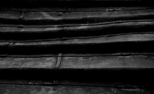
Horizontal 1
This is a tightly-framed image of a lead roof on a church. The horizontal lines are very dominant in the image and are accentuated by the strong shadow and contrast from the afternoon sun. There is very little happening in the image besides the horizontal lines so this is a very good portrayal.
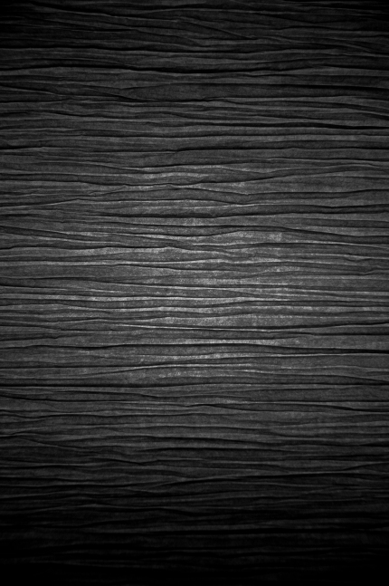
Horizontal 2
Again, due to the fact that there is very little in this image other than the horizontal lines, this is rendered a good example. The lines are a little more subtle than in the first image, however, the quantity of lines help to illustrate the point.
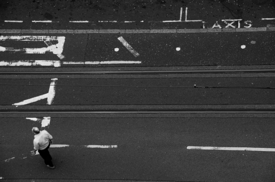
Horizontal 3
This is my favourite image from the set because of the irony. The strongest and most noticeable horizontal lines in this image are the painted white lines on the road followed by the tram lines that run parallel to them. There are many variations of horizontal line in this image: there are short painted white lines in the top of the image marking the taxi rank, tram lines, painted road markings and even the road between the lines could be considered lines themselves because of the proximity.
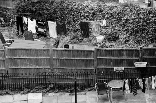
Horizontal 4
This image illustrates the point less successfully because it is a little busier than the others; the lines don’t always appear to be the first thing you notice, however, they are there. There is not as much contrast in this image so the lines are not as bold and distinctive.
Vertical 1
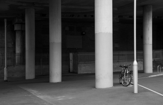
This is my favourite of the vertical collection, the bicycle in the right of the image adds interest and a good focal point, breaking up the repetition. The pillars and lamp-post provide a good, strong vertical illustration.
Vertical 2
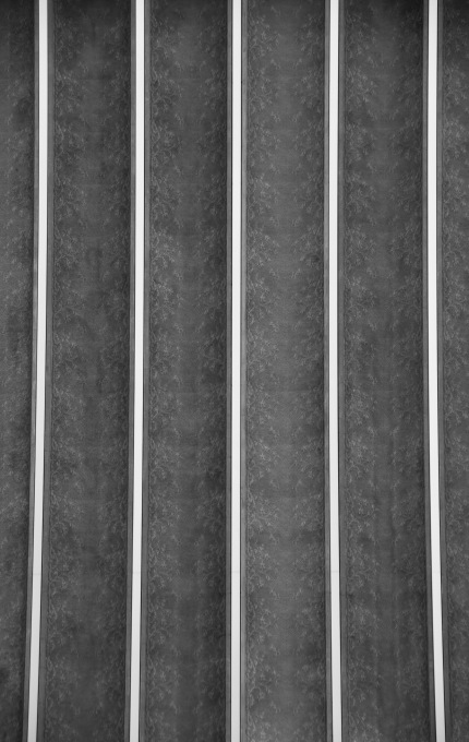
This is a strikingly simple image and illustrates the point extremely well. The thin bright white lines compared to the thick mid-grey concave areas are a stark contrast making this image successful in its intent.
Vertical 3
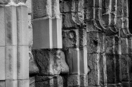
This image is a little busier but conveys the objective quite well. A variety of shapes, shades, and textures remain to continue with the theme of the exercise.
Vertical 4
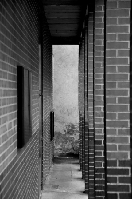
The brick columns on the right of this image provide the strongest depiction of the objective. The heavy shadows on the inside of the columns create a strong contrast making the lines prominent. The image is comprised mainly of elongated rectangles so there is an element of horizontal portrayal, though very small. These shapes themselves help the image to convey a perpendicular characteristic.
Conclusion
In this exercise I have learned when and how these patterns appear and the uniformity and regularity in which they appear. I have also learned that these patterns and structures can be very important to provide a strong composition and stability to an image. As a result of doing this exercise, I will endeavour to incorporate this element of stability into an image should I believe that the image would benefit from this. Although both vertical lines and horizontal lines give stability and strength, they are at the same time very different from each other; vertical lines represent height, speed and direction, whereas horizontal lines have a calming, soothing and heavy quality.
