This assignment is categorised into four parts, each pertaining to a specific kind of colour relationship. We were asked to produce four photographs, for each of the relationships, that demonstrated and portrayed the characteristics of each with variable subject matter; both naturally occurring and prearranged. For this assignment I decided to display a series of images comprised from the most eclectic subject matter that I could, to ensure a peripheral analysis on the objective. To accompany each image, I have added a painted illustration, suggestive of the colour and its movement. The colours may not exactly match those in the photographs.
Part One – Complementary Colours
For this part of the assignment, we were asked to take four photographs illustrating two complementary colours in each. Complementary colours are colours that oppose each other on the colour wheel; these colours, together, obtain the highest aesthetical value when used in the correct ratios. The ratio of colours in this part of the assignment may not be the same as those scrutinised in the previous exercise ‘Colour relationships’.
Blue and orange

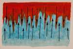
This is an image of a rusty extraction shoot on the top of a town building, that has been subject to rain, and is displaying large amounts of rust. I particularly like the way in which the image is split into two parts; because of its simple composition, the focus has largely become that of the colour. The two colours are quite uncommon shades of each, and because of this, they balance each other rather well. It is quite abstract in its appearance, with the orange part of the image resembling something of an almost liquid-like state, running into the blue; or a reminiscence of stalactites. Due to the warm appearance of the orange, you almost cannot help but think of fire or lava. Contrasting the orange entirely, both aesthetically and conceptually, is the texture within the cold blue steel, which lends it an icy characteristic.
Orange and blue

This is a photograph of piles of an orange spice blend on a blue chopping board. I wanted the narrowest depth-of-field I could achieve, to show less detail, rendering the colour to be the main focus of the image. Both colours in this image match each other, not only in shade and intensity, but also in vibrancy, showing harmonious use of colour. The antithesis of the colour is reinforced by the difference of the very structure of the two objects; the orange is ground into a fine powder, where-as, the blue is strong and whole. In contrast, the orange could symbolise the strength and unity of land, where-as, the blue could symbolise the much more ‘free-spirited’ nature of the sea.
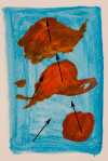
Purple and yellow


This image is a little more banal than the previous two, not leaving a great deal to the imagination; it is two creatures within their own surroundings, symbolising normality and the comfort that everything is as it should be. The ratio of purple to yellow is considerably high and the image could benefit a more balanced ratio to display true colour harmony.
Red and green


This is a photograph of three limes placed equidistantly down one side of the frame on a red chopping board. Interestingly, the balance and harmony that is achieved with using complementary colours is almost counteracted by the unbalanced nature of the compositional elements. I don’t believe that this alters the colour harmony or balance that is achieved when using this kind of colour relationship, but only the image as a whole. For these colours to work harmoniously together, the ratio must be more balanced. Unfortunately, there is a rather unattractive cyanic colour glare illuminating the texture of the board in the centre that is present as a result of mixed light sources.
Part Two – Contrasting Colours
For this part of the assignment, we were asked to capture four images, each illustrating the use of two contrasting colours. Contrasting colours are colours that lie adjacent to neighbouring colours; more precisely, colours that lie a third of the way around the colour wheel from each other. These colours are said to hold a high aesthetic value, but are not usually harmonious like complementary colours.
Orange and green

There are various shades of green and orange in this image, each shade contrasting another somewhere else. Contrary to the name of this particular type of colour relationship, I believe that the two colours in this image are closer to being harmonious than they are contrasting; opposing my expectations of the results. This is rather interesting and has inspired me to find more examples demonstrating similar characteristics.
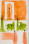
Purple and green

The central alignment of the compositional elements in this frame help to suggest the unsupportive nature of using these kinds of colours in unison; that is not to say that these colours, again, appear quite harmonious and complementary. I attempted to merge the different shades of colour by using a shallow depth of field, allowing the colours to appear bolder and more dominant, and softening the detail. The focus is on the green plant as this occupies a smaller portion of the frame, this helps to balance the colours more attractively.
Red and blue


This is a photograph of the roof of a boat. Its tight frame has allowed the colours to be the focus of the image, which boldly express the contrast between the two colours with their richness and vibrancy, but again, the two colours seem to work rather well together. These colours contrast each other in temperature as well as in the way that is described in this particular kind of relationship; the red is warm, and the blue is cold. There is a good ratio of colour within this frame, it is almost equal.
Red and yellow


This photograph is composed of two bushes, splitting the frame into two equal parts; one red and one yellow. Because of its simple composition and its lack of compositional elements, the colour, again, is the dominating feature of the photograph. The branches are almost reminiscent of veins or capillaries and are equally as delicate in appearance. This gives the two colours a similarity or a sense of relation, contradictory to the contrast that we perceive when using these types of colours together.
Part Three – Similar Colours
For this part of the assignment, we were asked to take four photographs, each conveying the characteristics of either cool or warm colours. Similar colours are colours that all sit adjacent on the colour wheel, for example: red, orange and yellow; or, purple, blue and green. These are either cool or warm colours. I have decided to take two photographs illustrating cool colours and two photographs illustrating warm colours.
Cool colours one
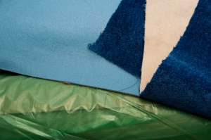

This is the first image of the cool colours set. I have only included two of the three cool colours in this image; blue and green. I believe that purple could act doubly as a warm colour and a cool colour and therefore creates difficulty when trying to convey one or the other. I think that the lighter shade of blue helps to develop a sense of coolness and adds contrast to the image. There is a patch of the reverse side of a piece of carpet that also adds contrast to the image without adding any warmth, due to its neutral colour and characteristic.
Cool colours two


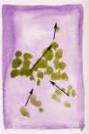
I took this photograph of a Mandarin fish in a marine fish tank, as it, and its surroundings display all of the cool colours in the colour wheel in variable shades. The ratio of purple to other colours in this image is quite high and leads to a controversial argument as to whether or not purple should be conceived as a cool colour or a warm colour; I think that it depends on the shade as it is comprised of a warm colour and a cool colour mixed together. Then, so is green. The environment in which this fish lives helps, only to support the coolness in this image as when we think of the sea, we more often than not, think of the cold.
Warm colours one


There are many different shades and variations of red, orange and yellow in this image of tiles on a rooftop. Illuminated by the warmth of the diffused afternoon sun, this image conveys warmth exceptionally well. The geometric composition adds strength to the image and helps to support the reassurance of familiarity and repetition.
Warm colours two


This is a photograph of the lining of a jacket, its silk-like appearance adds luminosity and vibrancy to the colours, helping them to appear warmer. There is a small amount of purple in this image that, in my opinion, does not make any alterations to the overall temperature, supporting my theory that purple could be used in either similar colour relationship.
Part Four – Colour Accents
For the final part of the assignment, we were asked to produce four images that showed accented colour. Colour accent is a relationship or situation when any particular colour appears as a small spot in the image amidst a much larger and abundant amount of colour, usually occupying a large portion of the frame.
Blue


For the first image in this part of the assignment, I chose a blue padlock hanging on a shed door. The contrast in vibrancy and temperature of the two colours in this image, help to identify the elemental object and accentuate the blue. All lines show strength in the composition and help lead the eye to the accented colour.
Green


This is a photograph of a green moss growth on the surface of a piece of slate. The composition plays a very important role in making the accented colour the prevailing feature of the image. The lines and cracks in the slate help to lead the viewer into the accented colour in conjunction with the ring that remains from where a plant pot once stood; the moss perfectly positioned on the circumference. The two colours are both cool and follow the basic principles of the similar colour relationship.
Orange


The colour accent in this image is accentuated by, not only the difference of colour compared to those found in the rest of the image, but also its luminosity; the bright luminous orange really detaches itself from its surroundings. Carefully positioned in the bottom left third of the frame, it is balanced by the compositional elements in the top right of the frame. The orange colour accent is considerably warmer than most of the colours found in the rest of the image, again detaching itself from its surroundings.
Yellow


This stone, found in the wall of some castle ruin, governs this image in two ways; firstly, it is different in colour; and, secondly, it protrudes from the wall much more than the rest of the stone. The repetition of the wall and its stone, help to carry consistency through the frame and gives the larger proportion of the image a certain banality which aids the accented colour in carrying out its duty.
Conclusions
I have learned, in this assignment, that contrasting colours can be just as harmonious as they can be contrasting and that the word ‘contrasting’ may only be used in an ambiguous sense. I have also learned that not all colour relationships strictly conduct the same principles as others, and the portrayal and psychology of colour used can largely be manipulated by the photographer. I have learned that ratios, vibrancy, shade and intensity all need to be equivalent, or closely matched, to achieve a more harmonious balance of colours. I have found this exercise more difficult than first anticipated, largely because of locating these very unique situations, but also because of the ambivalent and subjective nature of colour relationships; scrutiny becomes a series of contradictory questions.
I have never thought about the use of colour this profoundly and will endeavour to use the fundamental principles described in this assignment and its preliminary exercises when working with colour in the future. I have really enjoyed this assignment as I don’t generally shoot a great deal in colour, and I have to say, I understand it more than I did before.


